
Registering for a free webinar, downloading an e-book, or starting a free trial doesn’t need a form as long as a census. Long forms demand time commitments and private information that a basic landing page or blog post hasn’t earned.
Shorter forms get filled out more, and once you prove your value with your webinar, e-book, or free trial, you can ask for more information. Shorter forms increase conversion rates and build more honest relationships with your customers.
If you are guilty of making forms that are too long or are building a form soon and looking to learn more. Well welcome aboard, I’m going to show you how shorter forms can help you stand out from all of the websites that scare away their potential customers with long forms. Let’s get started!
How to make sure nobody ever signs up
I recently wanted to use a martech product and was asked to fill out this form for a 7 day trial:
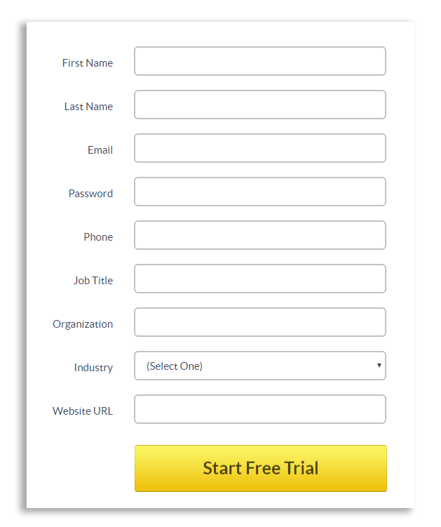
Problem # 1: I don’t trust the brand enough with my information. The phone number, in particular, is a big problem for me. It might be sold to a third party company and my dinners will be forever ruined by pesky telemarketers.
Problem #2: It’s a 7-day trial. Is the product so mind-blowingly amazing that it’s worth so much of my personal data? If the user is asking herself this question, conversions will drop. Believe me.
Problem # 3: I see at least three unnecessary fields (phone number, organization, industry). By getting my website URL it would be easy to tell what company I work for and what industry we’re in.
I know this format is fantastic for pumping data into a CRM but the user shouldn’t be the one making things easier for the company – it should be the other way around.
Problem # 4: All fields are required. Since it’s clear the company doesn’t give a hoot about my experience, I made sure to give some fake answers.
As a salesperson, would you rather get incomplete information or wrong information? My guess is the former. Try sending a nurturing email to whatever fake name they gave you and have them take you seriously.
The rational mind makes most choices on a cost-benefit analysis. The value gained from performing an action must be greater than the value of the inputs. Otherwise, the action is not worth it. Make your form worth it.
Bigger corporations with brand recognition are more trusted but even they can’t get away with asking more. Take the case of Expedia.
By omitting a single field, Expedia was able to increase their annual revenue by $12 million. ONE field! It was the company field if you were wondering.
I am not promising that you are going to make $12 million more by making your form shorter, but you will definitely increase the number of people completing your form. And if that ends up with you making more money at the end of the funnel, sweet!! Whether it is more signups, more donations, or more purchases, shorter forms provide a better experience and in return, more of your users will click submit.
2 small design tweaks will have a huge impact on your conversion rate
The strategy here is to ‘conserve vertical space’ without removing any fields. Usually if the form looks shorter, a user will feel like it takes less time to fill out. It’s an optical illusion of course, but humans think a lot less rationally than you think. So smaller forms work!
For example, compare these two options:
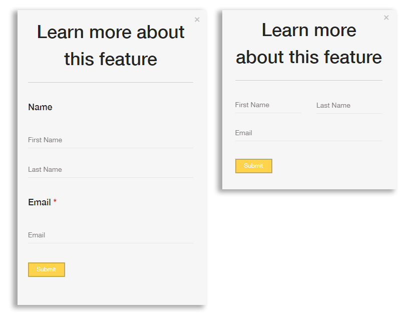
They ask for the exact same information but one does it in about 60% of the vertical space. That’s a huge difference!
Tweak # 1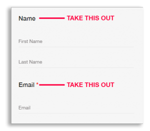
The optimized form has no field names.
Field names can easily be swapped out in a simple form. Of course, it is more difficult to do on a longer form with intricate questions where simply removing all labels might make the form more confusing.
In general, always use placeholder text and, when possible, cut back on repetitive space-hogging labels.
Tweak # 2
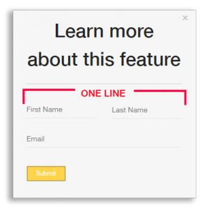 In our optimized form, we’ve moved the first name and last name onto a single line.
When fields are naturally related like this it is very intuitive to put them in the same row. Or better yet, you could combine them in a single box and just call it full name!

Your form shows your priorities to potential customers
So only ask what you need to know RIGHT NOW. Start by analyzing the purpose for the form. Is it to get someone to sign up for free? In that case it’s likely that you will only need an email. Is it to know how they found your website? Maybe you only need a name. Each field you include will negatively impact your conversions so ask only what is necessary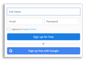 .
.
Dropbox for example, a well trusted company, only asks what you see here on their sign up form.
This is so much more inviting as a user than the martech form we saw earlier. Dropbox’s form shows me that they respect my time. I know they want to get me using Dropbox, not fill out the perfect profile for their CRM.
Another simple thing to cut out:
The description text: the text that appears below the title and is often used to clarify the purpose of the form.
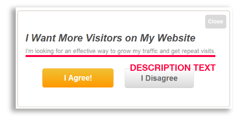 If your form title and buttons are worded well, the description can be omitted. In the example here, the description text is reiterating the title. It doesn’t clarify anything, all it is doing is taking up space.
The text that appears on forms is referred to as ‘microcopy’. Being able to write it well is an art and a topic we plan to write a blog about in the future. For now, check out Hubspot’s take on it.
One last trick
If you want all the information, but don’t want to scare the users away there is a form feature for you and it’s called progressive profiling.
Instead of making the user fill out a long form, ask them questions gradually over time. You can do this with dynamic forms that ask different questions each time a lead visits your website. After a few visits, you will have all the information you need to know about a visitor.
Our devs have been even built this into Blitzen making it easier for our customers (and our marketing team!) to get more information from leads over time.
Conclusion
The less space there is between the first field and the submit button, the likelier it is the form is going to be completed. Take these tips and try them on your own forms. We’d love to hear if they work as well for you, as they have for us and our customers.

